
(Slightly updated on 2016-06-11.)
Professor Emeritus Jamal Munshi of Sonoma State University has papers recently cited in science denier circles as evidence that the conventional associations between mean global surface temperature and cumulative carbon emissions are, well, bunk, due to the making of a simple and well-known statistical error: Correlations of cumulative sums of otherwise random quantities are positive. In fact, he has a widely circulated paper proclaiming this “discovery” (*). (Also available here.) What this claim says is that graphs such as this:

(Click on image to see larger figure. Use your browser Back Button to return to blog.)
or this:

(Click on image to see larger figure. Use your browser Back Button to return to blog.)
are highly misleading, at least when viewed through the narrow lens of a correlation coefficient, because both the abscissa and ordinate values are accumulations of quantities. (He even has a YouTube video about this.) Worse, and to the point of (e.g.) Professor Munshi’s recent work. Professor Munshi’s opinion and position on all this is well known, and often cited in climate denier circles.
The trouble is that similar relationships hold without doing the accumulation:

(Click on image to see larger figure. Use your browser Back Button to return to blog.)
That is, a relationship holds if per annum increases in atmospheric CO2 are plotted against annual emissions of CO2. The same can be done with temperature anomalies versus annual emissions of CO2, and that will be shown below. Professor Munshi does not point this out.
But the literature on this already exists, and as a scholar, Professor Munshi is being highly selective in the evidence he wants to show. Setting aside the physical science basis for all this, including the strong isotopic evidence (**), and restricting ourselves to the observational series, Professor Munshi has conveniently ignored certain published findings, even if his “Spuriousness of correlations between cumulative values” paper reports what is basically a 5 minute exercise using (the statistical programming language) R, does not really address temperature, CO2, or climate data, and nevertheless has 45 references to climate science papers, and 7 references to his own work. In fact his calculations are all done using various kinds of simulated random numbers, apparently in Excel.
One modern work establishing the relationship between changes in temperature and changes in CO2 was published in 1990 by Kuo, Lindberg, and Thomson all from the Mathematical Sciences Research Center of the famous AT&T Bell Labs. It was called “Coherence established between atmospheric CO2 and global temperature”, and published in Nature 343, where they performed a multiple window spectral analysis of CO2 and temperature series, doing it in a manner sensitive to the possible non-stationarity of the signal. (See Slepian sequences. Co-author Thomson in fact invented spectral multitaper analysis. The corresponding method for unevenly spaced data is the Lomb-Scargle method.) They go on to quote a 1965 reference (Yule and Kendall) regarding the matter Professor Munshi’s article concerns (***), and then proceed to establish the connection between atmospheric CO2 concentration and global temperature using their data and spectral coherence. While they found a very significant trend, they cautioned that because the relationship between effective temperature and CO2 concentration is nonlinear, they advise caution in causal interpretation. I’ll have a bit more to say about that nonlinearity below.
The work of Kuo, et al was repeated with improvements and reported in 2009 by Park in his “A re-evaluation of the coherence between global-average atmospheric CO2 and temperatures at interannual time scales“, appearing in Geophysical Research Letters 36. Park also had the benefit of knowing of pioneering work like that of Dettinger and Ghil in 1998, where they applied singular spectrum analysis to the same question limited to the tropics (iv). Park also had access to better data. Park explains an odd five month lag between temperature and CO2 concentration reported by Kuo, et al, as a result of a 2006 repair done to the dataset Kuo, et al had used. Nevertheless, with some minor exceptions, Park establishes the same result, and remarks that his work suggests that human emissions may have outpaced the oceans ability to absorb excess CO2. Like Kuo, et al, Park remarks on some of the complexities of the carbon-cycle flow, especially pertaining to ENSO, and the well-known oscillation seen in the Keeling Curve fine structure, but go on to examine the fine structure of temperature-CO2 feedback and offer a first order dynamic model in explanation.
Wilson investigated and reported the same question in 2010, using both spectral and vector autoregressive methods (v). In “Atmospheric CO2 and global temperatures: the strength and nature of their dependence“, Wilson dives in to calculating the spectral coherence between the temperature and CO2 series immediately, the object of the two examinations by Kuo, et al, and by Park. He does that to examine if the causal connection between temperature and CO2 is plausible, before proceeding to go on to other models. Like Munshi, Wilson seems unaware of the geophysical literature, even if he uses similar but not identical techniques, and arrives at even stronger conclusions (vi). In my opinion, Wilson ends up with a very fine structural equation model using vector autoregressions. Wilson’s SEM implicitly contains specific lags that any electrical engineer would love, capturing not only the causual connection between atmospheric CO2 and temperature, but describing less strong but still present feedbacks in the other direction, as well as the effects of the Southern Oscillation. Continuing work in the spirit of EE-type analysis, Wilson constructs a predictive transfer function model of Northern Hemisphere temperature (“NHT”) upon atmospheric CO2 concentration and its first two time derivatives. In fact, Wilson demonstrates that such temperature is controlled strongly by annual changes in atmospheric CO2 concentrations and most strongly by the rate of increase in those changes. Accordingly, the analysis makes Munshi’s conclusions and analysis, or anything like them, incompatible with a proper analysis of these datasets, relegating them to the category of “not well thought through”.
A more recent examination of the fine structure of temperature-CO2 interrelationships was reported by Wang, Ciais, Nemani, Canadell, Piao, Sitch, White, Hashimoto, Milesi, and Myneni in 2013 as “Variations in atmospheric CO2 growth rates couples with tropical temperature“, Proceedings of the National Academy of Sciences 110(37). Wang, et al do a careful lags analysis to assign changes in carbon budget to different source, and to explain secular variations in certain intervals. This work, and those done by Wilson, Park, and partly by Lindberg, and Thomson illustrate to me that a problem not addressed is that causation as a concept is not powerful enough to capture what is going on. What’s going on is best described as a coupled system of differential equations. What is described below is not, strictly speaking, correct physics, but it serves to illustrate why causation as a rhetorical concept can be a problem for these systems. I have implemented and discussed a more realistic system describing “correct physics” elsewhere (vii).
Now, if 


Here 


We don’t need to be satisfied with the simple model below, and can make it incrementally more realistic. For instance, there could also be a scrubbing term, 

With a scrubbing term, the picture is more complicated still, and “causation” can only survive as a concept unless invoked as “caused relatively greater by”. These kinds of complexities are, by the way, enough for me to ditch Hume’s positivism altogether, and certainly Ayer’s logical positivism. That’s philosophy and probably of no interest to the reader, but it is illustrative of how far away some philosophical discussions and courtroom rhetoric are from the facts of Nature and science.
Finally, and in my opinion, the work of van Nes, Scheffer, Brovkin, Lenton, Deyle, and Sugihara published in Nature Climate Change in 2015 (30th March 2015) closed the book on any doubt that greenhouse gases force temperature. I wrote about their work elsewhere.
The absence of these citations in Munshi’s publications can only be properly attributed to sloppy scholarship. I wonder what else he missed. He certainly writes as if he has something deep to say about all this. Consider two excerpts. First,
We expect that equilibrium or steady state conditions between surface conditions and atmospheric composition is achieved relatively quickly within an annual time scale as described in the IPCC carbon budget (IPCC, 2014).
That’s just wrong and the vague reference to the IPCC doesn’t substantiate it. Equilibration of atmosphere and, say, oceans takes a long time, several hundreds of years, in fact. See Ray Pierrehumbert’s, section 8.4, page 520, Principles of Planetary Climate. But, neverthess, Munshi goes ahead with:
This pattern may contain the information that the Henry’s Law partial pressure effect (Sander, 2015) of surface temperature on atmospheric CO2 is the dominant force in this two-way dynamic relationship.
Sander (2015) is a collection of Henry’s Law constants. This sounds authoritative, but actually means nothing. Section 8.4 of Ray Pierrehumbert’s textbook addresses Henry’s Law in connection with CO2 concentrations in depth. Another pair of textbooks by John Harte (Consider a Spherical Cow, Consider a Cylindrical Cow) addresses Henry’s Law, as section 4 of Chapter III of one, and as an exercise, section 5, of Chapter V of the other. In the latter, Harte asks “Will the seas go flat?” because the constant in Henry’s Law is temperature dependent and, so, like too warm soda or beer, CO2 is driven out if the fluid is too warm. Harte shows it can happen, but only at temperatures which are ridiculously incompatible with life. That means that, in fact, surface temperature is not the “dominant force in this two-way dynamic relationship” and, in trying to assert causality where there is none, Munshi gets it wrong.
Turning to my own analysis (which I did for fun), I’ll use linear methods, and confine my assessment to quarterly changes in temperature and atmospheric concentrations of CO2, and then add some other elements and resolve. For this purpose, I’ll use dynamic linear models which, while consisting of linear parts, can in principle change them with time. For temperatures, I use those from the Berkeley Earth Surface Temperature project, publicly available, and, specifically, their land-ocean data. For data pertaining to atmospheric carbon dioxide, I use the (famous) Mauna Loa series from the Keeling Curve sites of UCSD. I also use the ocean heat content series for 700 meters depth from
Levitus, Antonov, Boyer, Baranova, Garcia, Locarnini, Mishonov, Reagan, Seidov, Yarosh, Zweng1, “World ocean heat content and thermosteric sea level change (0–2000 m), 1955–2010“, Geophysical Research Letters, 39 (2012), L10603, with data online. The data were limited to 700 meters because the 2000 meter data do not extend back far enough.
The means of analysis are dynamic linear models, generalizations of Kalman filters and SVD smoothers. These can be used with temperature series on their own, such as in the following analysis where HadCRUT4 temperature series and GISTEMP series are used together to form a combined estimate of actual surface temperature and trends.

(Click on image to see larger figure. Use your browser Back Button to return to blog.)
But here the interest is seeing how much better informed such a model is when regressions on CO2 emissions and ocean heat are included as regressors. In other words, can temperatures be better predicted when CO2 emissions and ocean heat are offered as independent variables? The thought is that if CO2 emissions explain temperature anomalies and ocean heat increase tempers their rise, that argues for their being directly involved, based upon observations only.
This gets squarely into the business of comparing quality of models. That’s a job for information criteria, as discussed by Konishi and Kitagawa, and by Burnham and Anderson, criteria also used in my applying these methods to HadCRUT4 and GISTEMP series. Essentially, scores like the AIC and AICc are derived from specific models and, for the same dataset, the score which is the lowest is the best relative fit.
The software and procedures used is the dlm package for R by Petris, Petrone, and Campagnoli, with more details here.
First, let’s look at the regressors data, the Keeling curve, shown quarterly, and quarterly ocean heat content. The period being studied is March 1958 through December 2015, chosen because it is common among the available datasets, and it is recent.

(Click on image to see larger figure. Use your browser Back Button to return to blog.)

(Click on image to see larger figure. Use your browser Back Button to return to blog.)
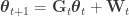
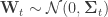
What’s meant here is that a state space representation is constructed for a temperature series, 


![\mathbf{X}_{t} = \left[ \mathbf{1} | X_{\text{CO}_{2}, t} | X_{\text{OHC}_{\text{700m}},t} \right]](https://s0.wp.com/latex.php?latex=%5Cmathbf%7BX%7D_%7Bt%7D+%3D+%5Cleft%5B+%5Cmathbf%7B1%7D+%7C+X_%7B%5Ctext%7BCO%7D_%7B2%7D%2C+t%7D+%7C+X_%7B%5Ctext%7BOHC%7D_%7B%5Ctext%7B700m%7D%7D%2Ct%7D+%5Cright%5D&bg=ffffff&fg=333333&s=0&c=20201002)
build<- function(parameter) {
           dlmModPoly(1, dV=max(10, parameter[1]), dW=c(max(0.01, parameter[2])), C0=diag(c(1))) +
           dlmModReg(X=X.c, addInt=FALSE, dV=max(10, parameter[1]), dW=c(max(0.01, parameter[6]), max(0.01, parameter[7])), C0=diag(c(1,1)))
          }
and its setup and use is shown in sequence below:
cat("Estimated variances for initialization of MLE search:\n")
dve<- c(BQv.b, BQv.b, CQv.b, CQv.b, CQv.b, CQv.b, HQv.b)*10
print(dve)
build<- function(parameter) {
           dlmModPoly(1, dV=max(10, parameter[1]), dW=c(max(0.01, parameter[2])), C0=diag(c(1))) +
           dlmModReg(X=X.c, addInt=FALSE, dV=max(10, parameter[1]), dW=c(max(0.01, parameter[6]), max(0.01, parameter[7])), C0=diag(c(1,1)))
          }
fit<- dlmMLE(y=B.Q.c, parm=dve, build=build, method="L-BFGS-B", debug=FALSE)
cat(sprintf("Convergence value: %.7f\n", fit$convergence))
bfp<- build(fit$par)
revW<- bfp[c("W")][[1]]
revV<- bfp[c("V")][[1]]
revGG<- bfp[c("GG")][[1]]
revFF<- bfp[c("FF")][[1]]
cat(sprintf("Estimated innovation variance:\n"))
revW[2,2]<- max(1, revW[2,2])
print(revW)
cat("Revised observation covariance matrix:\n")
print(revV)
cat("Revised process matrix:\n")
print(revGG)
cat("Revised observation mapping matrix:\n")
print(revFF)
In short, a function called build is defined and used in the dlmMLE call, along with initialization estimates, to obtain fits of parameters for the model, actually the terms:


in the preceeding. Initial values for parameters are obtained from the datasets using a Politis-Romano stationary bootstrap since the data are dependent data. Then, a Kalman filter is called, followed by a Kalman smoother to obtain point estimates of the evolving state,
dlmRSM<- dlm(m0=rep(0,nrow(revGG)), C0=diag(rep(1,nrow(revGG))), FF=revFF, V=revV, GG=revGG, W=revW)
cat("a priori DLM model:\n")
print(dlmRSM)
#
signalFiltered<- dlmFilter(y=B.Q.c, mod=dlmRSM, debug=FALSE, simplify=FALSE)
print(summary(signalFiltered))
signalSmoothed<- dlmSmooth(signalFiltered, debug=FALSE)
print(summary(signalSmoothed))
The code and datasets for all this are available as a tarball here. Be sure to load the R workspace (or image) called BEST-temp-anomalies.RData before trying to execute anything. It contains the datasets from BEST and NOAA used, and their common subranges, as well as versions decimated into quarters.
There were two groups of two cases each run. One group used the BEST land-only temperature series for the globe, and the other group used the BEST global land and ocean series. Each group had a case of the model described above, and, then, to check whether incorporating an element of serial correlation would improve the model, an ARMA(2) component was included in a second case, as:
  build<- function(parameter) {
             dlmModPoly(1, dV=max(5, parameter[1]), dW=c(max(0.01, parameter[2])), C0=diag(c(1))) +
                   dlmModARMA(ar=parameter[c(3,4)], sigma2=exp(parameter[5])) +
                   dlmModReg(X=X.c, addInt=FALSE, dV=max(1, parameter[1]), dW=c(max(0.01, parameter[6]), max(0.01, parameter[7])), C0=diag(c(1,1)))
            }
As suggested above, scoring of the models was done using the Akaika Information Criterion (AIC) and its variants, implemented in the R package AICcmodavg. Calculating the likelihood of a time series model is not easy, and, fortunately, the dlm package has a function which does just that, with AICcmodavg having a function that accepts such a likelihood and producing a value of the AIC. Note that models can only be compared on the same data sets so it makes no sense to compare performance of models on the land-only versus the land+ocean datasets. The idea is that the better model is the one with the numerically smaller AIC. Note the idea of the AIC is to penalize models which are more complicated, having more parameters. The actual call of this looks like:
dlmRSM.logLik<- dlmLL(y=B.Q.c, mod=dlmRSM, debug=FALSE)
cat(sprintf("Log-likelihood: %.5f\n", dlmRSM.logLik))
aicc<- AICcCustom(logL=dlmRSM.logLik, K=7+1+2*nrow(dlmRSM$GG), return.K=FALSE, second.ord=TRUE, nobs=N, c.hat = 1)
Note the actual value returned is something called AICc, which is an AIC corrected for a finite dataset.
So, what does this produce? The basic regression model without ARMA(2) on the land only temperatures produces the following:

(Click on image to see larger figure. Use your browser Back Button to return to blog.)
With ARMA(2), the results are:

(Click on image to see larger figure. Use your browser Back Button to return to blog.)
Note that the AICc for the regression without ARMA(2) is lower in value than the one with it, and, so, it is judged a better model. Note, too, the 95% confidence ranges on the fit series, showing a good explanation to the data, and the conclusion that CO2 with ocean heat does explain land temperatures well.
Overprinted on the plots is the Mount Pinatubo volcanic eruption, a major one, because such volcanic eruptions are known to have a cooling effect for a year or two following.
What about land+ocean temperatures?
Here’s the result from the basic regression model:

(Click on image to see larger figure. Use your browser Back Button to return to blog.)
And the result from the model with the ARMA(2):

(Click on image to see larger figure. Use your browser Back Button to return to blog.)
Again, the basic model performs better, according to the AICc.
And as far as Professor Munshi’s argument goes, he’s been disproved again. The calculation is shown above.
I have taken the assessment a bit further in a succeeding blog post.
Down the road, I’d like to explore what generalized additive models might bring to the assessment. There’s certainly precedent. Simon Wood rounds off his great text on Generalized Additive Models: An Introduction with R with an example in Section 6.7.2 of finding a statistically significant long term upwards trend in a daily temperature series for Cairo for a decade (viii). He also finds a confidence interval. It’s an increase of about 1.5 degrees Fahrenheit over the decade. By the way, Professor Wood remarks in the setup:
It is clear that the data contain a good deal of noisy short term auto-correlation, and a strong yearly cycle. Much less clear, given these other sources of variation, is whether there is evidence for any increase in average mean temperatures over the period: this is the sort of uncertainty that allows climate change skeptics to get away with it.
(*) I have corresponded with Professor Munshi regarding his paper, and he’s kindly offered to give me access to his datasets, as described in the paper. However, I had difficulty accessing his DropBox archive, and, even if he offered to email his datasets to them, after reading his paper, inspecting some of his other papers, and reviewing the existing geophysical on the matter, the material in his paper was sufficient to be able to respond. I thank Professor Munshi for his cooperation, even if I am necessarily hard on him in the above.
(**) Professor Munshi has another (recent) paper (“Dilution of atmospheric radiocarbon CO2 by fossil fuel emissions”) claiming that the reduction in radiogenic CO2 is due entirely to natural decay and has nothing to do with dilution of naturally present radiogenic CO2 with fossil fuel emissions which, because of the age of the Carbon they contain, are necessarily free of radiogenic CO2. This post does not address that argument, although, as will be seen, my analysis shows immediately that fossil fuel dilution cannot be ruled out by Munshi’s argument. A solid refutation will need to await for another day. In the meantime, I refer readers to Graven’s very visible 2015 PNAS paper, another one which Munshi appears to have missed. It is particularly ironic that, in the context of the present discussion and Munshi’s complaints about correlation, he uses the 

(***) Indeed, Kuo, Lindberg, and Thomson make a suggestion:
Many of the contraditions in the literature about the analysis of climate data can be traced to the use of inappropriate or oversimplified models [references given]. Statistical techniques that are vulnerable to difficulties include those based on parametric models (such as low-order autoregressive moving-average representations) and methods plagued by more insidious problems caused by implicit assumptions of time-series stationarity. The cavalier use of parametric models can lead to misspecification difficulties because unanticipated effects (such as the modulation of the annual cycle discussed below) either re undetected, are attributed incorrectly or are simply lumped in as part of ‘residual variance’. As shown below, the CO2 concentration and global temperature series have complicated spectral density functions, so these series are not likely to be modelled by any simple form in either the time or frequency domains. The fundamental flaw of parametric models, including numerical atmospheric models and time-series models, is that they make no provision for the unexpected.
(Emphasis added by me.)
(iv) To understand why singular spectrum analysis (“SSA”) is so powerful, consider it’s use in reconstructing values of the Keeling Curve with an arbitrary segment deleted at whim:

(Click on image to see larger figure. Use your browser Back Button to return to blog.)

(Click on image to see larger figure. Use your browser Back Button to return to blog.)
(v) That Wilson uses any kind of autoregressive method is ironic since, in (**) above, Kuo, Lindberg, and Thomson impugn the effectiveness of (at least) “low-order autoregressive moving average” (ARMA) parametric models.
(vi) To clarify, Munshi cites geophysical literature 45 times, but none of these are directly related to the problem he is addressing, merely to conclusions which follow should Kuo, et al, Park, Wilson, and Wang, et al be correct. Wilson’s failing in citing literature can be forgiven because, as far as I can tell, no one in the geophysical literature thought of doing the SEM or the predictive transfer function. That’s probably because Wilson is a statistician, and the geophysicists have their heads properly concerned with understanding phenomena. After all, the geophysicists appear unfamiliar with Wilson’s work, too: He is not cited in the bibliographies of either Glover, Jenkins, and Doney, Modeling Methods for Marine Science, or von Storch and Zwiers, Statistical Analysis in Climate Research, or Wilks, Statistical Methods in the Atmospheric Sciences, 3rd edition, and there are no citations to it from geophysical literature in Citeseer.
(vii) This is the Hogg, de la Cuesta, Garduñoa, Nuñez, Rumbos, Vergara-Cervantes, and Oestreicher development which is apparently well known. Oestreicher provided a summary presentation in 2010.
(viii) This link has been updated from that in Wood’s text, which has apparently changed: It was given as
http://www.engr.udayton.edu/weather/citlistWorld.htm
.


Pingback: Six cases of models | Hypergeometric